Survey results: Product insert
Survey Question
Product insert
Response Progress
0of 20
Ordered20
Received0
Fulfillment0.0%
Winner
Option B
0.0% of total votes
Runner Up
Option A
0.0% of total votes
Total Responses
0
2 options
Voting Results
Distribution across 2 options
Winner

Demographics
Respondent breakdown by gender & age
Gender Split
20
total
Male75%
Female25%
Age Distribution
Individual Responses
20 responses
M
Male, 35Option B415 days ago
I would be more drawn to this choice because it has more info.
What they didn't likeThis choice just looks too vague and I'm not sure I would feel compelled to scratch it.
F
Female, 61Option A415 days ago
I like how simple this is and the splash of color. The scratch off area is impossible to miss given how simple the design is.
What they didn't likeThis option is so busy it makes me not want to read it to figure out why I should take action.
M
Male, 50Option B415 days ago
Option B is more visually engaging and informative. It clearly explains the bonus value ($200), includes a QR code, gives a deadline for urgency, and provides a full URL. The design is colorful and playful, which aligns well with a gift-like product insert.
What they didn't likeIt lacks clear instructions, reward details, and urgency. The generic “SCRATCH AND WIN!” message feels vague, and there's no mention of what I could win, how to claim it, or why I should care. The dark background also makes it less inviting compared to Option B.
M
Male, 69Option A415 days ago
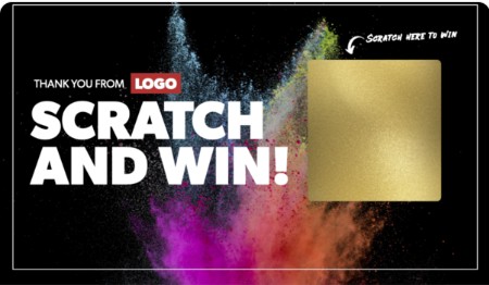
"A" looks simpler; more straight forward.
What they didn't likethere sure is a lot to read with "B." it's intimidating just to glance at it.
F
Female, 36Option A415 days ago
The design featuring "Scratch AND WIN!" with a designated scratch-off area and the enticing "SCRATCH HERE TO WIN" instruction is the most likely to make me take action. The immediate promise of a potential reward is a strong motivator.
What they didn't likeWhat I didn't like the least about the "Scratch Off To Reveal Bonuses" option is the requirement to manually enter a URL and a bonus code within a 24-hour window to claim the unspecified "bonuses" worth $200.
M
Male, 73Option B415 days ago
Clearly describing exactly what you get here
What they didn't likeNo real info details given here
M
Male, 49Option B415 days ago
I would choose B, it is more colorful and captures my attention better, and it provides much more information about potential prizes and what is needed to redeem them.
What they didn't likeThe colors are dark and unexciting, and there is very little information on the insert.
M
Male, 44Option B415 days ago
I like the aesthetic of option A but option B actually has more data so I know what's going on with the scratcher and codes and stuff.
What they didn't likeI didn't like the lack of information. Cool, a scratcher but what can I win, how do I actually do something with it?
M
Male, 38Option B415 days ago
the reason why i went with b was because of the scratchers cover
What they didn't likei just didnt enjoy the dark design
M
Male, 33Option B415 days ago
Before participating I want to have all of the information that I can do that I know what I am getting into.
What they didn't likeI wish there was more information on this that the basic scratch here to win.